Strong Homepage SEO Optimization
Heading:
The most important rule you should follow when creating an H1 tag: make them highly relevant to the content on the page. Don’t make your visitor dig to find out who you are and what you do. How many should you use? It’s an age-old SEO best practice to only use one H1 tag per page. Adhering to this rule and formatting content in a clear hierarchy ensures you are doing your best to assist search engine indexing and conforming to W3C guidelines.
Calls to Action:
Calls to action (aka CTAs) are finally getting the attention they deserve. You’ve built a website for a reason and your site visitors should actually do something when they arrive. Building in clear, action-oriented CTAs are the best way to lead site visitors down your intended conversion path.
Content:
Considering the rapid pace at which the Google search algorithm is changing, it can be difficult to keep pace. Panda and Penguin, which placed priority on keyword-rich content linked to or from other sites, have been replaced by Hummingbird. The new algorithm is focused on specific queries phrased as questions and is striking down the keyword-rich content and lauding unique content that is helpful, genuine, and relevant. What does this mean for you and your website? It’s time to believe all of the talk about the value of meaningful content creation. Updating your site on a frequent basis with unique content that aims to solve your users problems has never been so important.
1. Sprout Social
Why it’s exceptional:
- Strong, to-the-point, non-branded H1 tag: Powerful Social Media Software
- Good use of H2: management & engagement platform for social business
- Clear call to action: Start your free trial
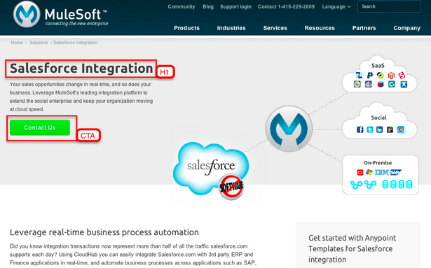
2. Mulesoft

Why it’s exceptional:
- Good H1 tag: Salesforce Integration
- Very prominent call to action: Contact Us
Where could they improve? Note that Mulesoft includes another H1 tag wrapped around non-visible text. If they removed this their H1 tag would be even stronger.
3. Cloudbakers

Why it’s exceptional:
- Direct call to action: See our products
- Split homepage design: Aside from the company logo, the two main graphics you see when you first come to the homepage represent their two primary services (Google Apps and Zoho CRM). Each graphic then links to its respective landing page. Although they offer other products (represented with the CTA) they choose the most important elements of their site and prominiently feature them.
- Testimonial Treatment: Effective use of testimonial content
4. Hubspot

Why it’s exceptional:
- Strong, clear H1: Hubspot Salesforce Integration
- Concise descripton of the product/service below the image
- Good use of H2 tag in explaining the product/service
5. OpenHallway
Why it’s exceptional:
- Clear, straight to the point H1 tag
- Prominent call to action (also called out with a different color in the main navigation)
- Concise description presented in a list structure. The description is supported by the Features and How It Works headings and the embedded video.
6. Mouseflow

Why it’s exceptional:
- Good H1 tag: Live Click Tracking & Website Analytics (both phrases, on either side of the ampersand, are good search keywords)
- Good H2 (including bolded words) that also serves as a concise description of the product
- Eye-catching call to action (below the video and also within the main navigation bar)
Request a Free SEO Quote for your website